Welcome to one of the most active flamenco sites on the Internet. Guests can read most posts but if you want to participate click here to register.
This site is dedicated to the memory of Paco de Lucía, Ron Mitchell, Guy Williams, Linda Elvira, Philip John Lee, Craig Eros, Ben Woods, David Serva, Tom Blackshear and Sean O'Brien who went ahead of us.
We receive 12,200 visitors a month from 200 countries and 1.7 million page impressions a year. To advertise on this site please contact us.
Posts: 3055
Joined: Aug. 30 2008
From: Boston, MA, U.S.A
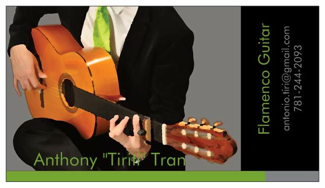
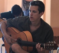
what do you guys think of my busines...
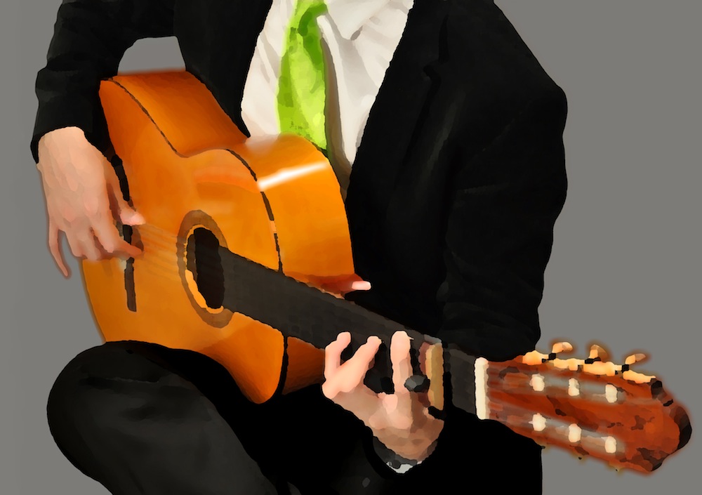
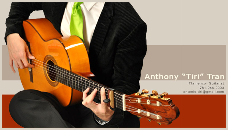
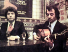
i just put this together today with the help of my girlfriend. i'd appreciate some feedback. i wanted something simple but a bit funky. i didn't bother deleting out my number so you guys can see the layout for what it is. dont prank phone call me!
Images are resized automatically to a maximum width of 800px
RE: what do you guys think of my bus... (in reply to Mike_Kinny)
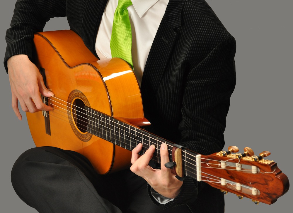
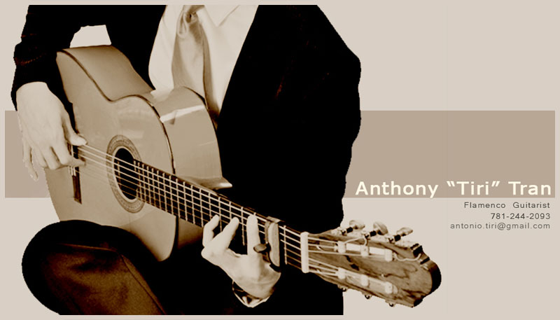
Nice card Anthony, but I like to see the original photo, maybe some colour adjustments, but this standard photoshop Palette Knife is "cheap". Or maybe its just the ugly guitar
I like the layout and colourschemes, your girl did a good job!
RE: what do you guys think of my bus... (in reply to at_leo_87)
Ole mate! However, could you make the distorted image show the strings more distinctly or clearly? I hate to look at guitars where the strings cannot be seen very lucidly.
Posts: 1976
Joined: Dec. 2 2006
From: Budapest, now in Southampton
RE: what do you guys think of my bus... (in reply to at_leo_87)
i agree with the guys, the effect on the image is not the best... but also i would a black outline or at least a strong shadow behind your name as it's barely readable and will be even worse in print!
Posts: 3039
Joined: Jan. 30 2007
From: London (the South of it), England
RE: what do you guys think of my bus... (in reply to xirdneH_imiJ)
I like it man! but lime green tie and font???? ...but thats just me!...infact "tie" whatever colour! ....I actually think the colour is fine but its the tie thats upsetting me.
I like the shirt undone vibe like in your avatar. much cooler. theres definately a line between looking professional and looking scruffy but you're a flamenco guitarist not a classical player. but I guess it depends what market youre after.
Is this for gigs or teaching or both?
by the way did you take the original shot? awesome quality!
Posts: 1531
Joined: Nov. 7 2008
From: New York City/San Francisco
RE: what do you guys think of my bus... (in reply to at_leo_87)
I like Kozz’ suggestion: contact details parallel to the strings (it would otherwise require the additional effort of rotating the card to read your email).
I also am partial to Kozz’ black & white rendition. It is simple and elegant vs the overwhelmingly aggressive color scheme of bright green over black.
Query: why not showing your face as well? Fortunately, you aren’t a disfigured hunchback of Notre-Dame, but have instead agreeable features and presence (as you avatar reveals). Losing your face may suggest otherwise. Just a thought –from a fan.
RE: what do you guys think of my bus... (in reply to gj Michelob)
The green tie doesn't seem flamenco enough for me. I would stick with blood red. I also liked Kozz's black and white rendition of your card. It made the picture of you with the guitar simple and elegant. Also what Michelob said, show us your face dep trai.
I also noticed you have 2 separate names on the card. I would use the name on your email address "Antonio Tiri". Lets face it, when people see a Vietnamese name on a card, you're just not going to have the same clout as with a Spanish name.
RE: what do you guys think of my bus... (in reply to edguerin)
quote:
I like the font on JimiHendrix's version but agree with the other guy's preference for the original picture.
Yeah...I like that one too (and with the original picture).
It's a pity that the side of the cejilla is a light colour as it kinda looks like you've got an extra finger.. . Maybe you could darken it down a bit with PhotoShop?
Posts: 1025
Joined: Oct. 14 2009
From: New York City
RE: what do you guys think of my bus... (in reply to at_leo_87)
I like the original photo over the stylized one – a red tie – delete all lime green - show your face – the cejilla looks like an extra finger – use one name. A last nit-picking thought – I personally would use "Flamenco Guitarist" instead of "Flamenco Guitar."
It would be nice if you could convey that you are available for both performances and for teaching, since that is the case.
It's a striking, professional looking card. Naturally be sure to put it on glossy stock.
RE: what do you guys think of my bus... (in reply to at_leo_87)
Why do all guitarists like to pose fancy chords on pictures?
And the main question... you hold a chord and play picado at the same time?.... Ok.. could happen and look like that in the right moment.. I would go with a rasguado in this picture with that chord.. Arpegio would also be believable.
And whats that greenish necktie? Are you biologist? (Im allowed to pull that joke coz I am biologist!) hehe
If you wanna go with the picture....than without colour.. monochrome.
I would not use any effects like the distorted filter.
RE: what do you guys think of my bus... (in reply to at_leo_87)
I like the basic layout; prefer the undistorted picture; the lime green doesn't work for me at all. Your name is hard to read - partly because of the colour - but if you move all the lettering slightly to the left (so that "Tiriti" and Tran go either side of your hand, and the -n no longer lines up with the side of your ass/jacket, it will be clearer.)
A darkish red would be better than green, or even magenta which would be more legible and has macho bullfighting associations so appropriate to flamenco.
Also the border at the bottom is nice in a way, but on the actual size card could be too busy. You already have the colour of the tie reflected in the lettering. If you were to lose the border it would make more space for your name.
To me the grey on black for the contact info is a bit too cool, and will be harder to read than necessary for some people, and seems to suggest that you might not really want them to get in touch with you. White is straightforward and clear.
RE: what do you guys think of my bus... (in reply to at_leo_87)
I think loosing the strings on the guitar doesn't look so good, too much image processing, but when you print out not sure the strings will show out much anyways. I would go with less image processing.
I want to see your head, but then it is memorable because it is not shown, so there is some mystery there. Is that an advantage or not? I wonder if it will be a disadvantage if you leave your card up on a board for random pick-ups.
Posts: 377
Joined: Nov. 22 2005
From: Quepos / Manuel Antonio, Costa Rica
RE: what do you guys think of my bus... (in reply to at_leo_87)
I really like the black and white one. The red is too much, in my opinion. I like the fact that you cant see your face...that way you can use the same business card years from now when you're old and wrinkly!
 Printable Version


 ...but thats just me!...infact "tie" whatever colour!


 New Messages
 No New Messages
 Hot Topic w/ New Messages
 Hot Topic w/o New Messages
 Locked w/ New Messages
 Locked w/o New Messages
 Post New Thread