what do you guys think of my business card? (Full Version)

Foro Flamenco: http://www.foroflamenco.com/
- Discussions: http://www.foroflamenco.com/default.asp?catApp=0
- - General: http://www.foroflamenco.com/in_forum.asp?forumid=13
- - - what do you guys think of my business card?: http://www.foroflamenco.com/fb.asp?m=144864


Message


at_leo_87 -> what do you guys think of my business card? (Sep. 12 2010 5:37:56)

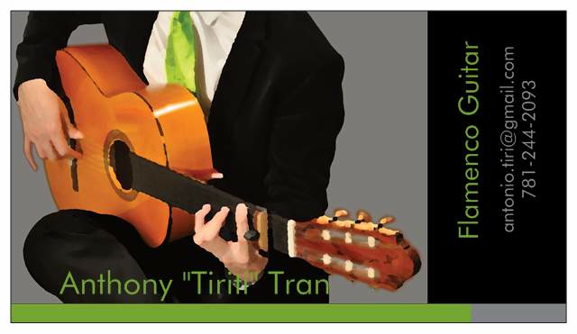
i just put this together today with the help of my girlfriend. i'd appreciate some feedback. i wanted something simple but a bit funky.
i didn't bother deleting out my number so you guys can see the layout for what it is. dont prank phone call me! [:@] [:D]


Images are resized automatically to a maximum width of 800px


at_leo_87 -> RE: what do you guys think of my business card? (Sep. 12 2010 5:40:12)

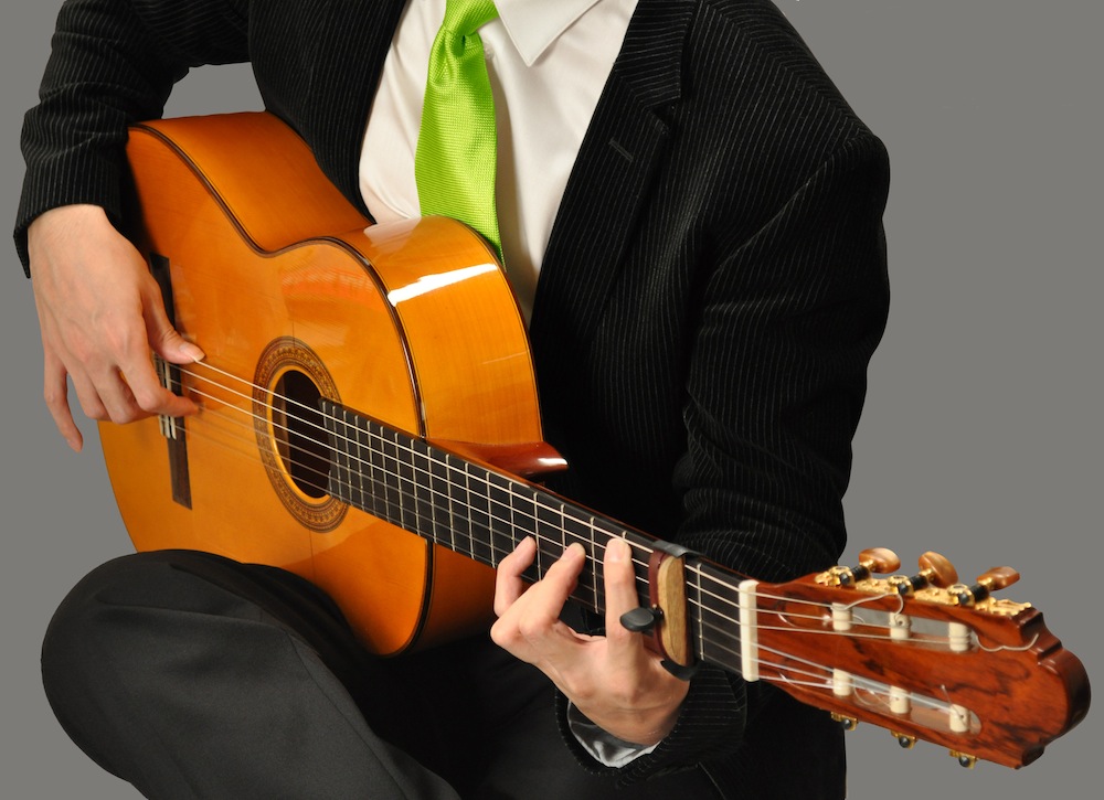
here's the original image.


Images are resized automatically to a maximum width of 800px


at_leo_87 -> RE: what do you guys think of my business card? (Sep. 12 2010 5:41:33)

and here's the distorted image.


Images are resized automatically to a maximum width of 800px


KMMI77 -> RE: what do you guys think of my business card? (Sep. 12 2010 7:03:16)

I really like it!

It's funky and shows Character


Graham_B -> RE: what do you guys think of my business card? (Sep. 12 2010 8:06:04)

That is a well designed and memorable card.

Love the tie [:)]


Mike_Kinny -> RE: what do you guys think of my business card? (Sep. 12 2010 8:06:47)

Nice!

By the way if you are a professional (meaning being a guitarist is your main activity) you should not enter "intermediate" challenge.


Ron.M -> RE: what do you guys think of my business card? (Sep. 12 2010 9:36:09)

Very classy!

A card like that is impressive, looks very professional and makes it clear that you don't play for drinks and tips. Which is important.

I vote 10/10.

cheers,

Ron


kozz -> RE: what do you guys think of my business card? (Sep. 12 2010 9:38:13)

Nice card Anthony,
but I like to see the original photo, maybe some colour adjustments, but this standard photoshop Palette Knife is "cheap".
Or maybe its just the ugly guitar [;)]

I like the layout and colourschemes, your girl did a good job!


Escribano -> RE: what do you guys think of my business card? (Sep. 12 2010 10:04:36)

I ike it but agree with Kozz on the PS effect.


Guest -> RE: what do you guys think of my business card? (Sep. 12 2010 10:15:32)

looks great...
the original image is more striking..more of the woods and flesh...stronger image
great colors...


rombsix -> RE: what do you guys think of my business card? (Sep. 12 2010 10:27:53)

Ole mate! However, could you make the distorted image show the strings more distinctly or clearly? I hate to look at guitars where the strings cannot be seen very lucidly.


xirdneH_imiJ -> RE: what do you guys think of my business card? (Sep. 12 2010 10:44:35)

i agree with the guys, the effect on the image is not the best...
but also i would a black outline or at least a strong shadow behind your name as it's barely readable and will be even worse in print!


xirdneH_imiJ -> RE: what do you guys think of my business card? (Sep. 12 2010 11:03:35)

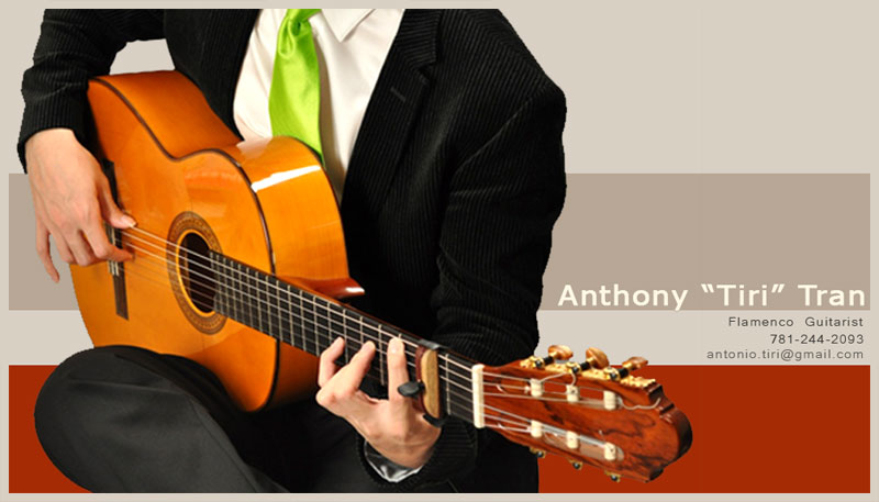
slightly different


Images are resized automatically to a maximum width of 800px


Stu -> RE: what do you guys think of my business card? (Sep. 12 2010 11:50:22)

I like it man! but lime green tie and font????[:'(] ...but thats just me!...infact "tie" whatever colour![:'(]....I actually think the colour is fine but its the tie thats upsetting me.[:D]

I like the shirt undone vibe like in your avatar. much cooler. theres definately a line between looking professional and looking scruffy but you're a flamenco guitarist not a classical player. but I guess it depends what market youre after.

Is this for gigs or teaching or both?

by the way did you take the original shot? awesome quality!


Chiste de Gales -> RE: what do you guys think of my business card? (Sep. 12 2010 11:57:44)

For flamenco, the accent color should be dark red of course.

Anyway, I think your nickname is awesome!


kozz -> RE: what do you guys think of my business card? (Sep. 12 2010 14:07:56)

another contest? [:D]
I like the green, is very fresh....Nino Josele also wear nice ties [:D]

Here's a few:


Images are resized automatically to a maximum width of 800px


kozz -> RE: what do you guys think of my business card? (Sep. 12 2010 14:09:01)

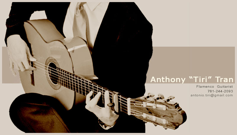
without colours


Images are resized automatically to a maximum width of 800px


edguerin -> RE: what do you guys think of my business card? (Sep. 12 2010 14:42:33)

I like the font on JimiHendrix's version but agree with the other guy's preference for the original picture.


Images are resized automatically to a maximum width of 800px


gj Michelob -> RE: what do you guys think of my business card? (Sep. 12 2010 15:06:06)

I like Kozz’ suggestion: contact details parallel to the strings (it would otherwise require the additional effort of rotating the card to read your email).

I also am partial to Kozz’ black & white rendition. It is simple and elegant vs the overwhelmingly aggressive color scheme of bright green over black.

Query: why not showing your face as well? Fortunately, you aren’t a disfigured hunchback of Notre-Dame, but have instead agreeable features and presence (as you avatar reveals). Losing your face may suggest otherwise. Just a thought –from a fan.


VietFlamenco -> RE: what do you guys think of my business card? (Sep. 12 2010 16:03:39)

The green tie doesn't seem flamenco enough for me. I would stick with blood red. I also liked Kozz's black and white rendition of your card. It made the picture of you with the guitar simple and elegant. Also what Michelob said, show us your face dep trai.

I also noticed you have 2 separate names on the card. I would use the name on your email address "Antonio Tiri". Lets face it, when people see a Vietnamese name on a card, you're just not going to have the same clout as with a Spanish name.


Ron.M -> RE: what do you guys think of my business card? (Sep. 12 2010 16:04:29)

quote:

I like the font on JimiHendrix's version but agree with the other guy's preference for the original picture.


Yeah...I like that one too (and with the original picture).

It's a pity that the side of the cejilla is a light colour as it kinda looks like you've got an extra finger.. [:D].
Maybe you could darken it down a bit with PhotoShop?

cheers,

Ron


Ramon Amira -> RE: what do you guys think of my business card? (Sep. 12 2010 21:45:22)

I like the original photo over the stylized one – a red tie – delete all lime green - show your face – the cejilla looks like an extra finger – use one name. A last nit-picking thought – I personally would use "Flamenco Guitarist" instead of "Flamenco Guitar."

It would be nice if you could convey that you are available for both performances and for teaching, since that is the case.

It's a striking, professional looking card. Naturally be sure to put it on glossy stock.


Doitsujin -> RE: what do you guys think of my business card? (Sep. 12 2010 22:28:35)

[:D][:D][:D] Why do all guitarists like to pose fancy chords on pictures?

And the main question... you hold a chord and play picado at the same time?.... Ok.. could happen and look like that in the right moment.. I would go with a rasguado in this picture with that chord.. Arpegio would also be believable.

And whats that greenish necktie? Are you biologist? (Im allowed to pull that joke coz I am biologist!) hehe

If you wanna go with the picture....than without colour.. monochrome.

I would not use any effects like the distorted filter.


Estevan -> RE: what do you guys think of my business card? (Sep. 12 2010 22:38:21)

I like the basic layout; prefer the undistorted picture; the lime green doesn't work for me at all.
Your name is hard to read - partly because of the colour - but if you move all the lettering slightly to the left (so that "Tiriti" and Tran go either side of your hand, and the -n no longer lines up with the side of your ass/jacket, it will be clearer.)

A darkish red would be better than green, or even magenta which would be more legible and has macho bullfighting associations so appropriate to flamenco.

Also the border at the bottom is nice in a way, but on the actual size card could be too busy. You already have the colour of the tie reflected in the lettering. If you were to lose the border it would make more space for your name.

To me the grey on black for the contact info is a bit too cool, and will be harder to read than necessary for some people, and seems to suggest that you might not really want them to get in touch with you. White is straightforward and clear.


Estevan -> RE: what do you guys think of my business card? (Sep. 12 2010 23:00:45)

quote:

Nino Josele also wear nice ties

Yeah but proper military ones, especially Guards [;)]


xirdneH_imiJ -> RE: what do you guys think of my business card? (Sep. 12 2010 23:04:47)

i like the green better, even if red is the official flamencolor...
Anthony will be surprised once he checks this topic [:)]


Images are resized automatically to a maximum width of 800px


cathulu -> RE: what do you guys think of my business card? (Sep. 12 2010 23:16:58)

I think loosing the strings on the guitar doesn't look so good, too much image processing, but when you print out not sure the strings will show out much anyways. I would go with less image processing.

I want to see your head, but then it is memorable because it is not shown, so there is some mystery there. Is that an advantage or not? I wonder if it will be a disadvantage if you leave your card up on a board for random pick-ups.

The colours don't bug me - looks good.


chrisva -> RE: what do you guys think of my business card? (Sep. 12 2010 23:26:50)

Great card.

How about the black and white version with a red tie?


Ramon Amira -> RE: what do you guys think of my business card? (Sep. 12 2010 23:32:02)

I've heard of the Headless Horseman, but the Headless Flamenco Guitarist?. . .[:D]


fevictor -> RE: what do you guys think of my business card? (Sep. 13 2010 2:28:42)

I really like the black and white one. The red is too much, in my opinion. I like the fact that you cant see your face...that way you can use the same business card years from now when you're old and wrinkly!


Page: [1] 2    >   >>

Valid CSS!


Forum Software powered by ASP Playground Advanced Edition 2.0.5
Copyright © 2000 - 2003 ASPPlayground.NET