Welcome to one of the most active flamenco sites on the Internet. Guests can read most posts but if you want to participate click here to register.
This site is dedicated to the memory of Paco de Lucía, Ron Mitchell, Guy Williams, Linda Elvira, Philip John Lee, Craig Eros, Ben Woods, David Serva and Tom Blackshear who went ahead of us.
We receive 12,200 visitors a month from 200 countries and 1.7 million page impressions a year. To advertise on this site please contact us.
|

|
|
RE: Some Granada pics
|
You are logged in as Guest
|
|
Users viewing this topic: none
|
|
Login  | |
|

   
ricecrackerphoto
Posts: 265
Joined: Feb. 5 2006
|
 RE: Some Granada pics (in reply to ricecrackerphoto) RE: Some Granada pics (in reply to ricecrackerphoto)
|
|
|
quote:
In general, for the vast of motives I see no matter related reason to leave out colour. ( B&W makes no insignia of art to me, other than like wearing trendy scarfs in the same unrelated sense of image.)
Ruphus, since this question gets asked all the time, I have some out of the can responses:
I did not leave out color but shot black and white film.
Color is extremely trendy and gets dated fast. For many color film images, a photographer can tell what era it is from because certain film stocks were in vogue at the time. Same with digital. Fuji, Canon, Nikon's digital sensors all have preset color spaces. This era will be known as the Canon EOS / Lightroom first digital wave or something like that.
I shot B&W film in a traditional way that has not changed in 90 years, the film recipe having not changed in about 40 years. Hopefully my images look classic and timeless.
B&W is really one color: grey. At my best, when I create a B&W image, it is all about the light. At my worst, it is just a monochromatic image.
When you shoot color, you are really shooting the colors of wall paint and clothes. B&W for me removes that distraction and hopefully conveys a sense of mood, person and place.
This iPhone photo of Jesus: it is not only not a good image at all, it is dominated by his blue work coat and the lustre of my blanca.
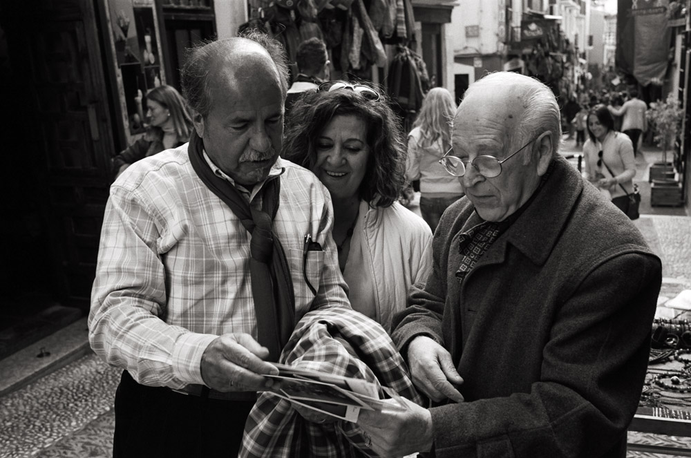
That photo of Niño in the street, his scarf was a striking scarlet. I hope in the B&W photo I posted of him that his personality comes through and the viewer can concentrate on that and not on his clothes.
Anyways, those are my reasons to leave out color.
Images are resized automatically to a maximum width of 800px
 Attachment (1) Attachment (1)
|
|
|
|
REPORT THIS POST AS INAPPROPRIATE |
Date Mar. 10 2012 11:16:04
 |
|
Ruphus
Posts: 3782
Joined: Nov. 18 2010
|
|
RE: Some Granada pics (in reply to ricecrackerphoto)
|
|
|
Hi,
Your thoughts make sense, but they have their contra indication just as well.
# Must we care about colour shortcomings / gravity of past celluloid brands / eras, when contemporary colour shaping like of Canon or Panasonic ( to my taste ) come out pretty fine? - And as you can chose your more or less natural presets to taste ( like e.g. equivalents to classic movie shades, if wanted)?
#
While colour can be distracting, B&W can just as well if not more so, as its is often harder to distinguish motive and background with the levelling out of B&W.
#
I didn´t express my self well with the hint on the scrarf.
What I meant is that as an analogy to B&W shooting, many who want to appear artist ( like your mediocre architect, abstract painter, etc.) wear scarfs ( some even throughout the seasons) to give themselves a corresponding "creative" appearance.
( I have a cousin who is a well-known artist, and I always tell him to not dress too much in black and wear no scarfs, as the wannabes out there are dressing that way. - Him having no need to wear "metier uniform".)
Similar with B&W. Who wants his pics to appear like art shoots B&W. I find that silly, the more with the great colour choice given these days ( and its challenge of composition).
Initially it was avantgarde, and rather reasonable seeing the imperfection of the pale or unbalanced colour photography of past century; but nowadays ... c´mon now.
Having said that, I don´t mean to brand all B&W photography as wannabe artistic, but frankly, it often is.
In my eyes motives demanding / enviting for B&W turn up much less than those for colour.
That´s my personal opinion, of course.
Ruphus
|
|
|
|
REPORT THIS POST AS INAPPROPRIATE |
Date Mar. 10 2012 15:58:48
|
|
Ruphus
Posts: 3782
Joined: Nov. 18 2010
|
|
RE: Some Granada pics (in reply to srshea)
|
|
|
quote:
ORIGINAL: Escribano
For film, b/w is cheaper, offers more latitude is and easier to process at home. That is why I mainly shoot b/w film. In digital, I rarely convert to b/w but some subjects just work better that way.
Agreed.
quote:
ORIGINAL: srshea
Some of these pics are really, really nice. I always appreciate seeing real film photography these days, and it's almost always instantly eye-catching in a way that digital never quite is.
I havn´t felt anything like that so far, and wonder what it would be that couldn´t be emulated with todays post options anyway. ( Just the uneven grain of celluloid?)
But it might be that I just can´t sense what others can.
In the early days of digital consumer audio, a friend of mine complained about the new sound, claiming that he could hear a terrible, interrupted bit sound. Not aware of anythig other than a certain brittleness with the HF myself, I thought his claim to be based on fancying. So, went and put on a CD, as well as the same album on venyl, time and volume aligned and started switching back and forth on that high end stereo. The SOB indeed managed to tell apart analog and bits on this blind test 100%, crinching everytime about the "butchered" digital, while to my ears both sounded just great.
Granted, I had no explicite clue about audio at that time, but my pal had no special education either. His ears could just naturally hear what mine couldn´t.
Ruphus
|
|
|
|
REPORT THIS POST AS INAPPROPRIATE |
Date Mar. 10 2012 20:45:58
|
|
ricecrackerphoto
Posts: 265
Joined: Feb. 5 2006
|
|
RE: Some Granada pics (in reply to ricecrackerphoto)
|
|
|
Ruphus,
I'm a professional photographer that primarily works in B&W film. That's great that you love color photography but I famously shoot horrible pictures in color. I just do not get color at all. There is a difference whether it provides any value to you or not.
Digital photography is full of trends that my other photographer friends are aware of and bemoan. Hyper-sharp HD for commercial images, creamy over-saturated images for weddings, retro-film stock looking iPhone pics for consumers. The digital camera sensor is in essence a designed film stock and this keeps changing with each iteration.
Your point of emulating film in digital is true, but for me why imitate a medium when you can actually use that medium. I'm sure I can get a dry, nylon guitar sound from a digital program but why not just play an actual guitar?
For Niño and the scarf, I was actually commenting on Niño's attire and how it would have proved to be a distraction.
Similar to the sound test that you described, it would help if you held a darkroom print in your hands versus looking at a digital print. The entire purpose of film is the print and that is where all the magic lies.
Estevan,
The worst thing, and I still think about it, is having to sit in the dusty chair in Rafa Moreno's taller and perform for him while he smoked and watched.
Simon,
I am back on the forum for a couple of reasons, not least of which is Kate's admonishment that I have been missing some great images from you the past couple of years.
Nice to be back!
Doug
_____________________________
http://www.ricecracker.net
|
|
|
|
REPORT THIS POST AS INAPPROPRIATE |
Date Mar. 10 2012 22:39:32
|
|
 New Messages New Messages |
 No New Messages No New Messages |
 Hot Topic w/ New Messages Hot Topic w/ New Messages |
 Hot Topic w/o New Messages Hot Topic w/o New Messages |
 Locked w/ New Messages Locked w/ New Messages |
 Locked w/o New Messages Locked w/o New Messages |
|
 Post New Thread
Reply to Message
Post New Poll
Submit Vote
Delete My Own Post
Delete My Own Thread
Rate Posts
|
|
|
Forum Software powered by ASP Playground Advanced Edition 2.0.5
Copyright © 2000 - 2003 ASPPlayground.NET |
0.078125 secs.
|
 Printable Version