|
Ruphus -> RE: Some Granada pics (Mar. 10 2012 15:58:48)
|
Hi,
Your thoughts make sense, but they have their contra indication just as well.
# Must we care about colour shortcomings / gravity of past celluloid brands / eras, when contemporary colour shaping like of Canon or Panasonic ( to my taste ) come out pretty fine? - And as you can chose your more or less natural presets to taste ( like e.g. equivalents to classic movie shades, if wanted)?
#
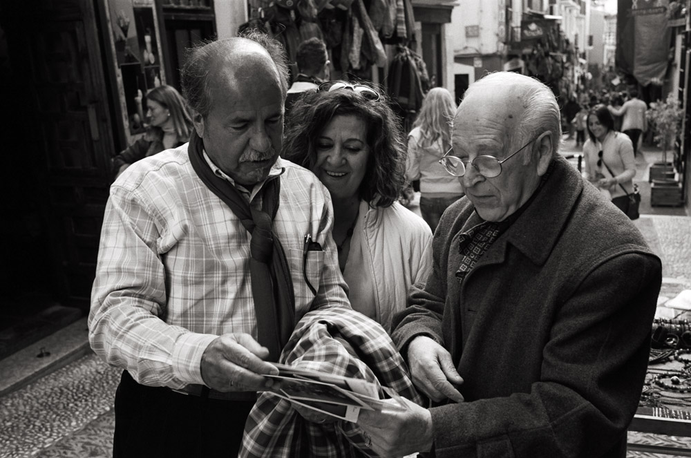
While colour can be distracting, B&W can just as well if not more so, as its is often harder to distinguish motive and background with the levelling out of B&W.
#
I didn´t express my self well with the hint on the scrarf.
What I meant is that as an analogy to B&W shooting, many who want to appear artist ( like your mediocre architect, abstract painter, etc.) wear scarfs ( some even throughout the seasons) to give themselves a corresponding "creative" appearance.
( I have a cousin who is a well-known artist, and I always tell him to not dress too much in black and wear no scarfs, as the wannabes out there are dressing that way. - Him having no need to wear "metier uniform".)
Similar with B&W. Who wants his pics to appear like art shoots B&W. I find that silly, the more with the great colour choice given these days ( and its challenge of composition).
Initially it was avantgarde, and rather reasonable seeing the imperfection of the pale or unbalanced colour photography of past century; but nowadays ... c´mon now.
Having said that, I don´t mean to brand all B&W photography as wannabe artistic, but frankly, it often is.
In my eyes motives demanding / enviting for B&W turn up much less than those for colour.
That´s my personal opinion, of course.
Ruphus
|
|
|
|