Welcome to one of the most active flamenco sites on the Internet. Guests can read most posts but if you want to participate click here to register.
This site is dedicated to the memory of Paco de Lucía, Ron Mitchell, Guy Williams, Linda Elvira, Philip John Lee, Craig Eros, Ben Woods, David Serva, Tom Blackshear and Sean O'Brien who went ahead of us.
We receive 12,200 visitors a month from 200 countries and 1.7 million page impressions a year. To advertise on this site please contact us.
Posts: 2277
Joined: Apr. 17 2007
From: South East England
RE: opinions, please help! (in reply to HemeolaMan)
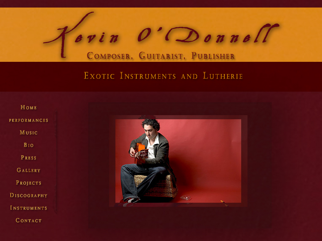
Love the colour Kev. Layout also good.
I prefer a font that's not in capitals, but that's just a personal thing. The font you have chosen is also quite "Olde Englishe", and if that's the impression you want it's good. But if you want to appear more young, modern and dynamic, perhaps try a different font.
Anyway I voted for "it's lovely", but I so liked the phrase "sack of catpoo" I felt genuinely sorry I couldn't vote for that one.
RE: opinions, please help! (in reply to HemeolaMan)
I do agree with Ailsa, nice colour palette and overall look. It's easy going for the eyes and that;s nice. A different font would indeed be nicer, but perhaps removing the shadow can do the trick also.
RE: opinions, please help! (in reply to HemeolaMan)
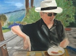
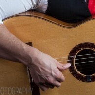
This might seem a little nit-picky but I'd photoshop the ashtray and lighter out of that photo. I have nothing against smokers at all, but the paraphernalia simply doesn't fit into the simplistic composition. Other than that I wouldn't change a thing.
RE: opinions, please help! (in reply to HemeolaMan)
Generally, I think you're onto a good design, but here's my thoughts:
The shadow effect on the font at the top is a little weird on the small letters of your name. The shadow fills in too much space in the letter and makes it look fuzzy. The black of the letters needs a better contrast with the background. Maybe a bigger font or less of a shadow.
You picture- The ashtray and whatever that is on the bottom right makes for a cluttered composition. Also you posture combined with that squishy seat you're on doesn't make me think of technically proficient playing. It just makes me think of slow chord strumming.
I hope this was helpful. I feel bad about the picture issues. I know its a hassle to do one of those.
RE: opinions, please help! (in reply to HemeolaMan)
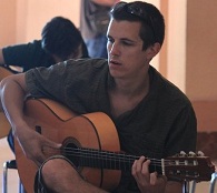
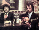
It looks promising, sobrino. I like the colours - including the background of the photo, which as you say works really well, I hope you can use something similar for your own photo.
I agree that the shading is overdone, and that you should have a more solid-looking seat; and trust that you will, of course, look more perky and switched on than J-M does here. You may not be intending to use this photo as a model for your own, but I think that having the space behind the subject looks contrived and awkward. Looking forward to seeing yours, which I'm sure will be much better.
looks greate man...and yeah i agree ...u should use your own photo...the idea is that you promote yourself not Leon
andf plus with is someone books you for a gig from this and expects to see that guy show up ...saves confusion
quote:
I'm trying to launch a new site for me... about me... and my guitar... and some flamenco
the site is about so put your own face in there..expecially on the first page ...imo, but i don know what u mean..it is a good photo and works well with your colours.. go and get a nice photo done with the same backgrown colours ...one good set of professionaly taken hi resolution photos is never a bad idea to have...a good investment...everyone always asks for high resolution photos if u ever need to advertise something/ or need it for poster, or an article etc.. ( or u might know someone with a good camera and good eye for photos)
page looks really tastefull..I love the velvet effect !
 Printable Version


 New Messages
 No New Messages
 Hot Topic w/ New Messages
 Hot Topic w/o New Messages
 Locked w/ New Messages
 Locked w/o New Messages
 Post New Thread