|
estebanana -> RE: surface (Jan. 28 2017 23:08:19)
|
Richard,
I'm just referring to Newtons charting out of light spectrum and how that is the basis of color science. Newton's book 'Optics' was a big start.
Light, you already know this, travels through materials, like the sea, formica, wood, varnish, leaves, all the thiings around us, the reflects back out of those materials. The world around us acts as a filter for the light, light passes though a material and is reflected back out, the amount of light entering and reflecting back out is called the Refractive Index. More transparent materials like thin leaves and varnish films have high refractive indexes, they allow more light in and out, a black fire charred surface of a burned house has low refractive index, not a lot of light escapes or is reflected back out.
Our eyes are sensitive to the frequencies of light that a particular materials refractive index allows to bounce out of it. Then the eyes,or brain takes that information and "develops" it on a screen in our brain.
It's just amazing. When we are talking about color on guitars, we are talking about manipulating a very small portion of that spectrum, and all the implications it comes with. Over time the substrate for the varnish will oxydize and become darker, thus effecting the refractive index. That is how you arrive at those mellow "old gold" colors.
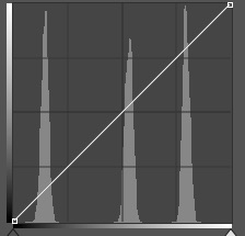
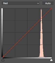
However color mixing outside the body to get these refracted perceptions to our brain involves following a method of color mixing that is scientific Color Theory is based on three primary colors, three secondaries and third colors between the second colors and primary colors. The primary colors are Red, Blue, Yellow, secondaries are Orange, Green , Purple, and the tertiary colors.
The tertiary color that lies between Red and Yellow is Vermilion and Amber- Vermillion is between Orange and Red- Amber is between Orange and Yellow.
The hues we associate with Conde's or guitars in general fall into a space between Orange and Amber, but complex tinting with other colors may be present to moderate the saturation and chroma intensity, or tone it down. But generally the Conde' spectrum is the edge of Vermilion as it goes to orange and then the other side of Orange as it goes to Amber.
The weird ting is there's all kinds of ways to do that, but the most simple direct ways are often the least interesting. The allure of that color on the Conde' is subject to all kinds of "flavoring" from outside that Vermilion - Orange - Amber zone. The earth colors fit into Yellow Orche, Burnt earths, Raw earths, like the Siennas, or the Naples earths, Red ochre, etc, all those colors fit into the spectrum between secondary and tertiary colors. But they fit in such a way that they are practically used to moderate refractive index in those colors to make them more subtle, to take the harsh edges off the more garish strains of vermilion in the varnish, for example.
So my solution to subtle is to not mess with the color too much an rely on oxidation of the ground, the guitar top, to darken and shift the refractive index, rather than do it ahead of time. Nature will take it's course. However if you are good and want to do it, making a varnish layer that is mixed to filter out some of the harshness is possible. And it's possible by layering different colors on the guitar. I believe the best and most intriguing Conde' colors of older Conde' were created that way. And that kind of stuff can be very pleasing, albeit pushed in a very determined way towards the hot vermilion end of the tertiary range The modifier in there is pink used to work the refractive index, but I'm not going to divulge how.
Pink? Where the hell does that does from? Pink should be a technical foul, a five yard penalty or a corner kick. Or a free throw, or a hockey player being ejected from the ice. Pink, the trickster, it comes from red being mixed with white. Yellow and white makes a weird yellow, blue and white makes a sky. But blue is powerful and multi faceted, the blue family has many members and they all have special functions in pictorial space. Not useful for guitars really, but blues are no joke, powerful. Yellow and white....not much use either, but mix yellow and black together and you get fantastic greens, add white and tints of green and you get a world of muted greens you could get lost in.
But Pink, mix white and red and the result gets it's own name. Pink. Put down a layer of pink and run amber- gold -brown-orange-red.....varnish over it and something special happens. But which pink and how is it carried? Which vehicle? How much white? Which red to begin with?
|
|
|
|