|
Ron.M -> RE: Web Site graphics (Jun. 5 2009 10:48:28)
|
quote:
Some very promising design ideas here!
Yeah Estevan,
I really think so too!
It's actually the only logo I've ever been enthusiastic about of all the suggestions before.
But it's gotta be right. [;)]
Can you imagine how many versions of the "Apple" or any other logo they looked at?
I'm sure it wasn't just the first couple of attempts!
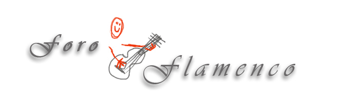
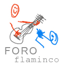
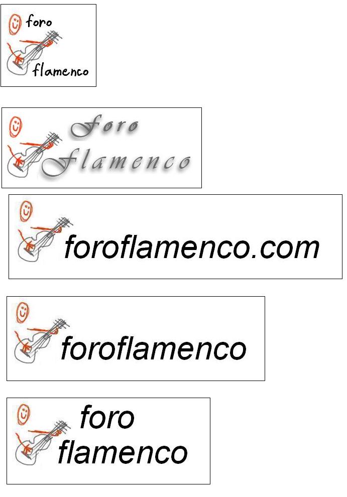
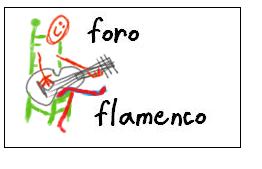
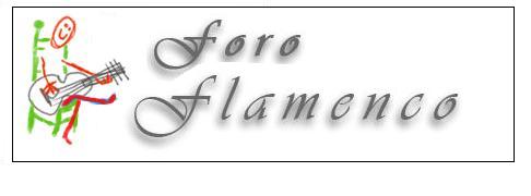
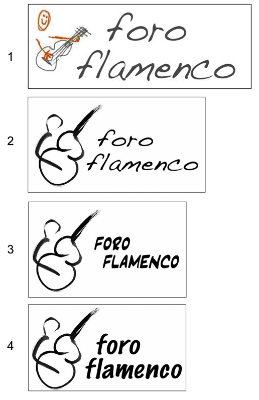
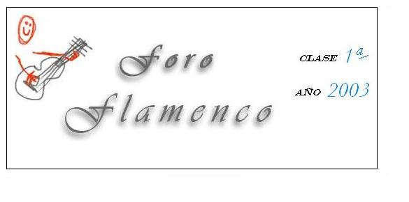
I love Kozz's original image, but it's got to be the right text style to make it appear innocent and childish, but a powerful logo.
It takes time to get things just right, as I'm sure we all here already know.
I'd be very happy and interested to look at any other member's text ideas based on the above philosophy and not changing Kozz's original image in any way.
That part is perfect IMO.
So get your PaintBox's and PhotoShop's out and start scribing!
Get the print style/ complete logo just right.
That is the current problem IMO.
cheers,
Ron
|
|
|
|