Web Site graphics (Full Version)

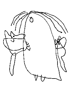
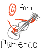
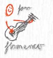
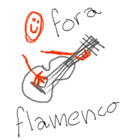
Foro Flamenco: http://www.foroflamenco.com/
- Discussions: http://www.foroflamenco.com/default.asp?catApp=0
- - General: http://www.foroflamenco.com/in_forum.asp?forumid=13
- - - Web Site graphics: http://www.foroflamenco.com/fb.asp?m=109304


Message


falsetanuova -> Web Site graphics (Jun. 2 2009 5:37:32)

Hello all:

It has been a long time, but when last here there was some competition for site graphic change...

..I recall someone winning or a t least another graphic being used.

What happened??

I hate to be pretentious, but the graphic for our revered "foro flamenco" is in a word......cheesy.

That poor pixilated flamenco dancer looks equal to "Pac-Man" in terms f quality/figurehead.


I'd hate for the classical snobs to say we are low class after all!


Any chance we can do some updates here???

ciao.


Ron.M -> RE: Web Site graphics (Jun. 2 2009 7:04:26)

quote:

It has been a long time, but when last here there was some competition for site graphic change...

..I recall someone winning or a t least another graphic being used.


If you mean the one with the dancer carrying the AK47, then that was when the site was under other management.

quote:

That poor pixilated flamenco dancer looks equal to "Pac-Man" in terms f quality/figurehead.


Oh, I'm not so sure really, that the plain simple graphic is so bad after seeing the various ideas for a suggested new one.[:D]

In fact I find it quite iconic now, considering what the Forum has been through.


cheers,

Ron


Arash -> RE: Web Site graphics (Jun. 2 2009 7:41:29)

I guess he is looking for something like this:


[:D]

Images are resized automatically to a maximum width of 800px


Arash -> RE: Web Site graphics (Jun. 2 2009 11:22:44)

Hey Ron, i bet you won't say NO to this Logo


[:D][;)]

Images are resized automatically to a maximum width of 800px


Pimientito -> RE: Web Site graphics (Jun. 2 2009 11:32:48)

[:D][:D][:D][:D] Ronatito


at_leo_87 -> RE: Web Site graphics (Jun. 2 2009 18:54:40)

HAHAHA @ arash
how'd you make that? i would vote for the first one, no doubt. no disrespect to ronatito.

i actually like the banner that we have now. i'd be a little reluctant to see it go but change is always fun and exciting.

quote:


I'd hate for the classical snobs to say we are low class after all!


they're just jealous of our right hand technique and sense of rhythm. [;)]


Arash -> RE: Web Site graphics (Jun. 3 2009 2:23:01)

quote:

ORIGINAL: at_leo_87

HAHAHA @ arash
how'd you make that? i would vote for the first one, no doubt. no disrespect to ronatito.


This one is for you [:D]


Images are resized automatically to a maximum width of 800px


Arash -> RE: Web Site graphics (Jun. 3 2009 3:53:38)

Ok, this is the final one.

I bet now my LOGO is accepted from Master Escribano as the Winner of the Logo Challenge [:D][:D][:D]


Images are resized automatically to a maximum width of 800px


Ron.M -> RE: Web Site graphics (Jun. 3 2009 5:32:23)

quote:

I bet now my LOGO is accepted from Master Escribano as the Winner of the Logo Challenge


[:D][:D][:D]

Hey, we don't want our Google rating even lower.

They may even classify us as an 18+ site too! [:D]

cheers,

Ron


Arash -> RE: Web Site graphics (Jun. 3 2009 5:54:17)

Hey Ron

Foroflamenco Pagerank: 2

Oldschool Pagerank: 1

Link Popularity: 465 Total for Oldschool and 3282 Foroflamenco

And thats even after all that Search Engine Optimization by Cpt. Bob LoL

Google still loves us more [:D][:D]


kozz -> RE: Web Site graphics (Jun. 3 2009 7:57:55)

quote:

I guess he is looking for something like this:


I'll definitaly go for this one....

Style: 9
Composition: 9
Aire: 10


Ron.M -> RE: Web Site graphics (Jun. 3 2009 9:00:42)

kozz,

I'd vote for your avatar as the logo.

I think it sums the Foro up nicely!


cheers,

Ron


edguerin -> RE: Web Site graphics (Jun. 3 2009 9:09:22)

So this is the new competition?
What's the prize?
when's the deadline?[:D]


kozz -> RE: Web Site graphics (Jun. 3 2009 9:17:23)

quote:

kozz,
I'd vote for your avatar as the logo.
I think it sums the Foro up nicely!
cheers,
Ron


That's a big honor Ron [:D]


kozz -> RE: Web Site graphics (Jun. 3 2009 9:18:45)

quote:

So this is the new competition?
What's the prize?
when's the deadline?

[:D][:D][:D][:D]

And not to forget:
What are the rules?
How do we judge?

[:D]


Arash -> RE: Web Site graphics (Jun. 3 2009 9:24:53)

quote:

ORIGINAL: edguerin

So this is the new competition?
What's the prize?
when's the deadline?[:D]


The prize is one year exclusive membership in oldschoolflamenco foro + one hand made flamingo guitar from master Mao Tao + one Encuentro DVD from Maestro Arash de Persia

[:D]


Ron.M -> RE: Web Site graphics (Jun. 3 2009 10:44:15)

quote:

That's a big honor Ron


I'm serious Kozz!

I've got a feeling that it's not your own work though, but drawn by a child.

Adults usually can't even come close to imitating that natural, unsophisticated style.


cheers,

Ron


kozz -> RE: Web Site graphics (Jun. 3 2009 11:25:49)

Don't worry it's mine....I think the child in me will never leave
[:D]
and that's a good thing aint it


Ron.M -> RE: Web Site graphics (Jun. 3 2009 12:23:55)

HaHa...Kozz,

That's great!

I like the simplicity of that style of stuff.

I still keep one from my daughter when she was about 4 or something, called "A Vet with Cats" LOL!

I use it as a Screensaver on my DOS programs 'cos it always makes me laugh.


Images are resized automatically to a maximum width of 800px


Arash -> RE: Web Site graphics (Jun. 3 2009 12:50:40)

thats cute Ron [:)]


at_leo_87 -> RE: Web Site graphics (Jun. 3 2009 17:07:28)

quote:

quote:

ORIGINAL: at_leo_87

HAHAHA @ arash
how'd you make that? i would vote for the first one, no doubt. no disrespect to ronatito.


This one is for you


nice work! okay

aire:1000
compas:1000
technique:1000

and most importantly...

sexiness:1000000

but i have to deduct 3 points because i think you just stole it from my avatar. [:D]


kozz -> RE: Web Site graphics (Jun. 3 2009 21:04:11)

quote:

I like the simplicity of that style of stuff.
I still keep one from my daughter when she was about 4 or something, called "A Vet with Cats" LOL!


That's a work of art! I also really do like these type of drawings.
It's a nice thing you still have such a drawing.

I followed an art class in the days when I was studying chemistry, and there even is a movement trying to immitate childrens drawings, and it indeed seems to be a hard thing to even approach a childs vision....


kozz -> RE: Web Site graphics (Jun. 4 2009 21:11:00)

at_leo_87, are you holding a gun or a lasersword?
[:D]

here's my attempt


Images are resized automatically to a maximum width of 800px


Ron.M -> RE: Web Site graphics (Jun. 5 2009 0:35:13)

Hey not bad Kozz, but still a bit too sophisticated for my taste.

I'd like to see smaller, lower-case, hand-written, childish text done with a black crayon.

Like the word "foro" to the right of the head and the word "flamenco" along the bottom, with the whole logo no wider than the original avatar and just a bit longer to accommodate the word "flamenco".

Sorry, but I'm awfully fussy about these things....[:D]

cheers,

Ron


Ron.M -> RE: Web Site graphics (Jun. 5 2009 7:39:31)

Sort of like this...[:D]

But not done with a mouse and better balanced and the crayon a bit thicker.


Images are resized automatically to a maximum width of 800px


kozz -> RE: Web Site graphics (Jun. 5 2009 8:22:35)

aha....i got you


Images are resized automatically to a maximum width of 800px


kozz -> RE: Web Site graphics (Jun. 5 2009 8:31:38)

or...


Images are resized automatically to a maximum width of 800px


kozz -> RE: Web Site graphics (Jun. 5 2009 8:40:40)

a little fun...


because I really like those green chairs [:D]

Images are resized automatically to a maximum width of 800px


Ron.M -> RE: Web Site graphics (Jun. 5 2009 8:46:25)

hmmm...

A bit like the second with the text straightened up (horizontal), slightly thicker pen (but not blurry) and "foro" not "fora".

Not the old fashioned style "a" in Flamenco.

Also no joined up writing as in the first.
Not too scrappy, but like a child being careful.

Make the whole thing balance as a visual logo too.

I'd make a lousy client. [:D]

(The client from Hell!)

cheers,

Ron


Estevan -> RE: Web Site graphics (Jun. 5 2009 9:17:04)

Some very promising design ideas here!

[for Kozz:]
Ron, don't be such a miereneuker!
[;)]


Page: [1] 2 3    >   >>

Valid CSS!


Forum Software powered by ASP Playground Advanced Edition 2.0.5
Copyright © 2000 - 2003 ASPPlayground.NET