Welcome to one of the most active flamenco sites on the Internet. Guests can read most posts but if you want to participate click here to register.
This site is dedicated to the memory of Paco de Lucía, Ron Mitchell, Guy Williams, Linda Elvira, Philip John Lee, Craig Eros, Ben Woods, David Serva, Tom Blackshear and Sean O'Brien who went ahead of us.
We receive 12,200 visitors a month from 200 countries and 1.7 million page impressions a year. To advertise on this site please contact us.
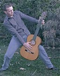
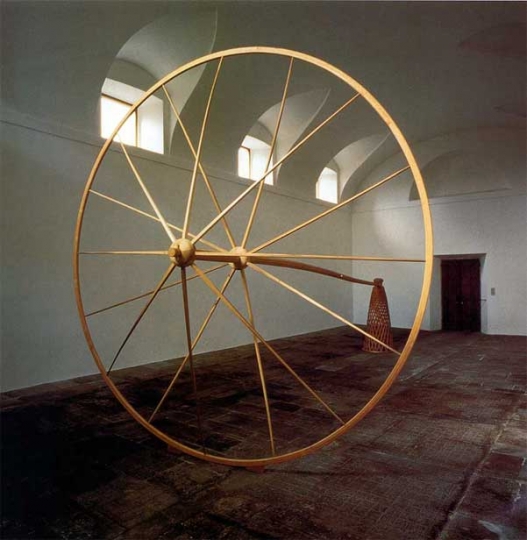
The message ( idea) might be a tad too pushing ( while I am usually not much better at it than that, as you might see with the example of a steel sculpture below. - pretty graphic, innit) , but the proficiency definitly is wonderful.
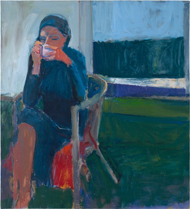
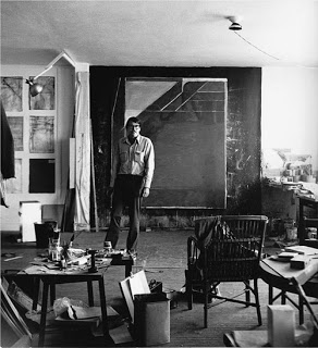
Whether with the twilight of the back wall and the hung jacket or leaned pictures, the lively tension in the guy´s sitting body, the great recognition of his shape, and not at last that piece of floor in the forground.
This is to the last brush exactly how a worn out / stained floor looks like.
Love the skills!
Ruphus
PS: Look at his trouser legs. See how he appears to have put on a second pair underneath, for the coldness of his studio. That´s what I´d call detail!
Images are resized automatically to a maximum width of 800px
Dovetails nicely with some of Stephens contentions.
In that arbitrary junk makes for vast of art markets capital depositting I guess, with that misapprehension of artistry having many talents stunted in ways presented in the painting above.
If you like that kind of stuff look at N.C. Wyeth and Norman Rockwell, they are both artist illustrators you may like.
I remember being in China in art school and seeing all the young painters who were doing politicically correct social realism. They used devices like these.
You might also like the trompe l' oeil tradition in American art, Harnett, John Peto:
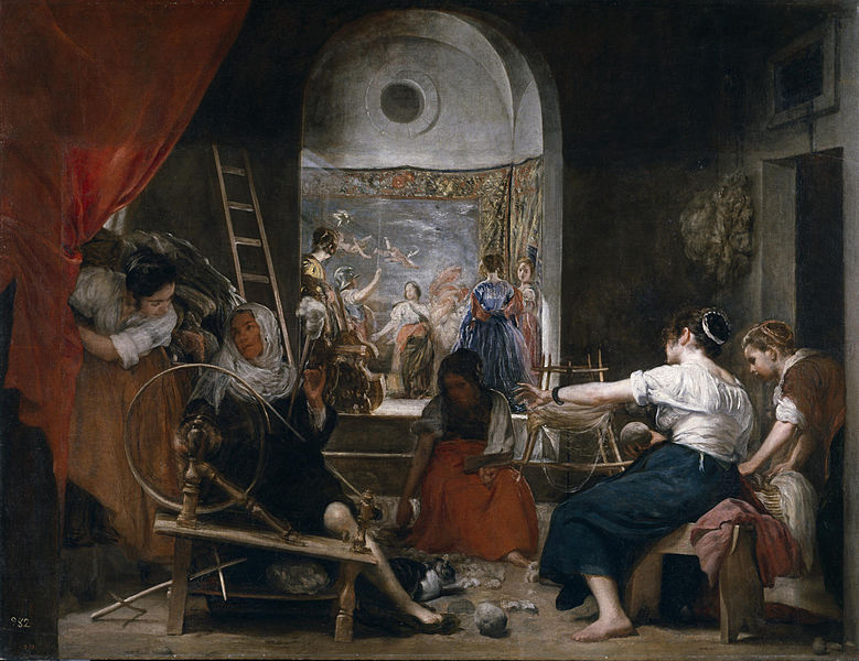
For conceptual tricks you don't have to go any more forward in time than Velasquez; he painted Las Hilanderas in the 17th century complete with catchy conceptual twist. He painted the spinning wheels in motions as a blur instead of a stationary wheel. That should be comforting for the reactionaries in the crowd.
Images are resized automatically to a maximum width of 800px
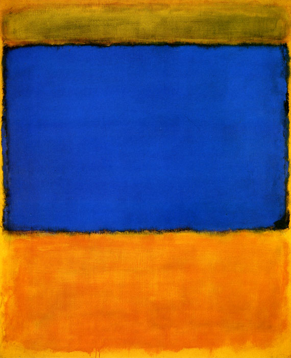
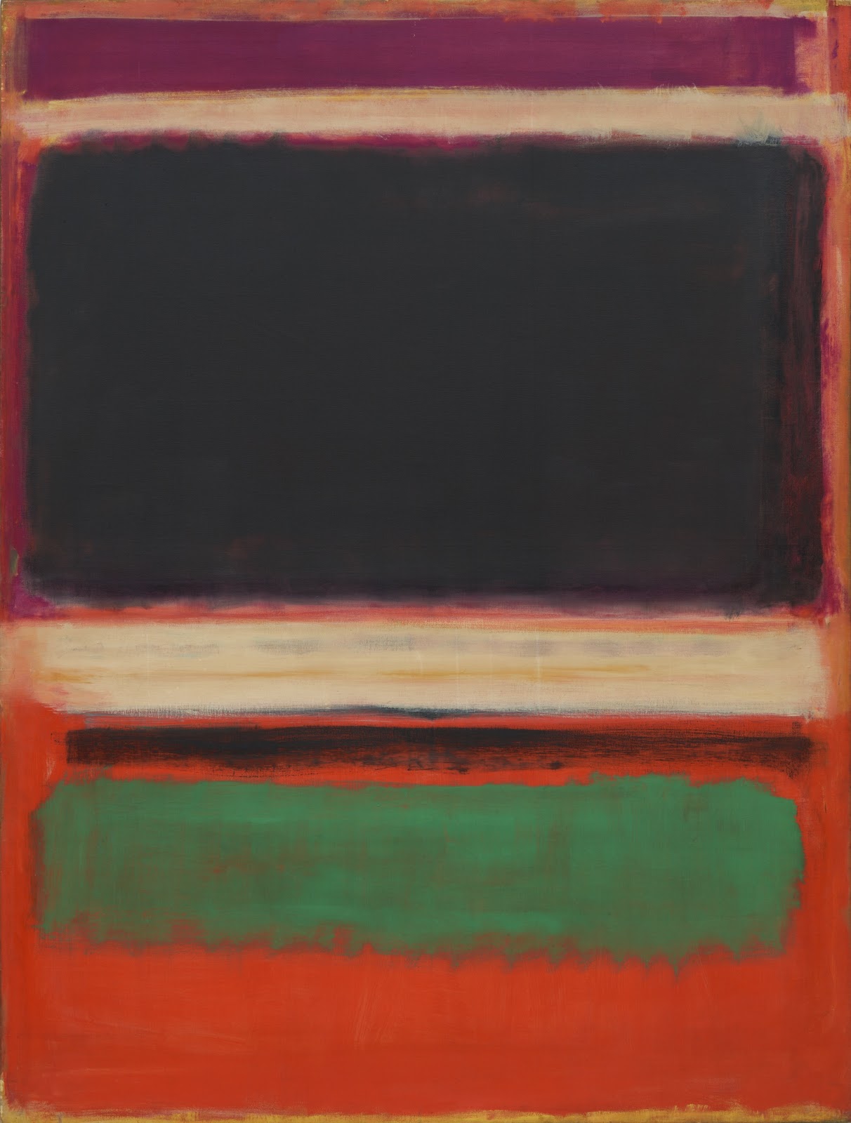
I don't understand the Rothko stuff, what exactly should we be admiring? (not being a smart ass, would really like to be edumacated)
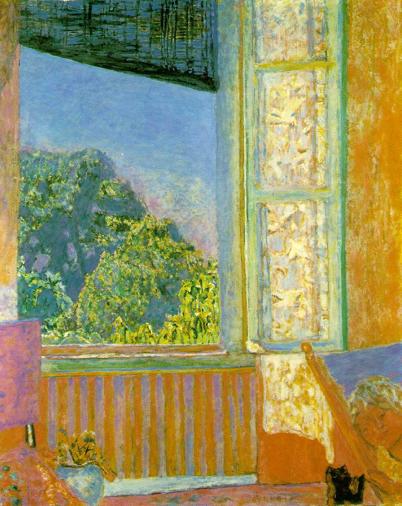
That's why I backed two Bonnard paintings before two Rothkos. Bonnards color and light describes a wall, a sky, a blind, Rothko's is your guess. It just exists as color and light.
Rothkos light and color are disembodied from a form you recognize, and it changes as you look. When you see a good Rothko it's like looking at a sunset. It's like a sunset has no solid form, these pictures are lighting each persons interior light.
But then again not everyone cares for Rothko, some times I feel them as really heavy.
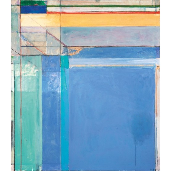
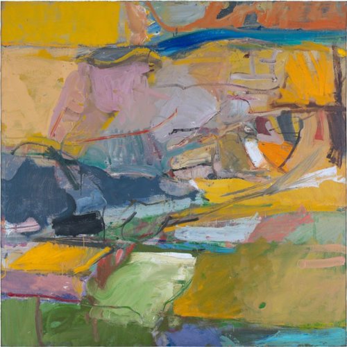
The idea was about the light in his Ocean Park studio in Santa Monica. The same way Rothko painted light and evoked things Diebenkorn does the same thing. His pictures are open and full of bright Los Angeles coast light. He works with structure in the painting to organize the big panels of light.
In real life this painting is about 7 feet by 8 feet. It is painted with thin washes of luminous color layer by layer.
Images are resized automatically to a maximum width of 800px
He got to this place by flattening landscape paintings. Eventually if you keep flattening you get shallow space full of light and you can invent your forms and lines. Like jazz.
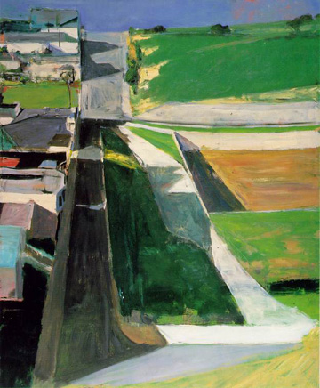
This pictures is a suburban city scape, you can see images of houses, but he is getting flatter. You see where the big expansive Ocean park paintings come from?
Images are resized automatically to a maximum width of 800px
His pictures are open and full of bright Los Angeles coast light.
That one does evoke an emotion for me, that does feel very much like Santa Monica just from the shades of light/color. I'll actually be driving down Ocean Park to get home in about an hour.........
Prior to the city scape which is more geometric, he did this organic landscapes. They were done up North in Berkeley and look like the light of the bay area and the forms are taken form landscape of the hills in Oakland and Berkeley. Again he plays with and invents forms like a jazz player. For these painters it was a matter os mastering realism so they could break it apart and play around inventing forms and light.
Images are resized automatically to a maximum width of 800px
That one does evoke an emotion for me, that does feel very much like Santa Monica just from the shades of light/color. I'll actually be driving down Ocean Park to get home in about an hour.........
If you ever go to the LA museums they will have a Dibenkorn or two out to see in person.

 Printable Version


 New Messages
 No New Messages
 Hot Topic w/ New Messages
 Hot Topic w/o New Messages
 Locked w/ New Messages
 Locked w/o New Messages
 Post New Thread