Foro Flamenco


Posts Since Last Visit | Advanced Search | Home | Register | Login

Today's Posts | Inbox | Profile | Our Rules | Contact Admin | Log Out


Welcome to one of the most active flamenco sites on the Internet. Guests can read most posts but if you want to participate click here to register.

This site is dedicated to the memory of Paco de Lucía, Ron Mitchell, Guy Williams, Linda Elvira, Philip John Lee, Craig Eros, Ben Woods, David Serva and Tom Blackshear who went ahead of us.

We receive 12,200 visitors a month from 200 countries and 1.7 million page impressions a year. To advertise on this site please contact us.


New website   You are logged in as Guest
Users viewing this topic: none
  Printable Version
All Forums >>Discussions >>Lutherie >> Page: [1]
Login
Message<< Newer Topic  Older Topic >>
 
Andy Culpepper

Posts: 3023
Joined: Mar. 30 2009
From: NY, USA

New website 

Hi everyone,
I drastically revamped my website in order to bring it into the 21st century. Please take a look, let me know what you think, and certainly let me know if you see anything that's not working. Mucha' gracia'

www.andyculpepper.com

_____________________________

Andy Culpepper, luthier
http://www.andyculpepper.com
  REPORT THIS POST AS INAPPROPRIATE |  Date Jul. 28 2014 22:09:08
 
pink

Posts: 570
Joined: Jan. 8 2013
 

RE: New website (in reply to Andy Culpepper

Hi Andy,
Congratulations on the new site.
My only criticism is that you perhaps need a ''named'' player in the 'what players say section'
I don't know how difficult this may be and its only a thought, but I felt worth a mention?
Very best wishes to you and I hope your success continues to grow......so well deserved.

_____________________________

  REPORT THIS POST AS INAPPROPRIATE |  Date Jul. 28 2014 22:20:58
 
tijeretamiel


Posts: 441
Joined: Jan. 6 2012
 

RE: New website (in reply to pink

Sideburn free Andy,

Looks good but on this page the numbers are missing information/details (for classical guitars).

http://www.andyculpepper.com/contactorder/

In terms of suggestions, which are things I believe would make improvement but are in no means absolute I personally think you should include some of the options you have provided for example Padauk etc. Also maybe having a link for your blog as one of the main headers?

Looks great though.
  REPORT THIS POST AS INAPPROPRIATE |  Date Jul. 28 2014 22:37:38
 
Mark2

Posts: 1871
Joined: Jul. 12 2004
From: San Francisco

RE: New website (in reply to Andy Culpepper

IMO, you should use the full names of the customers. It's so easy for anyone to post a bunch of reviews on their own site saying "this guitar is the greatest thing I've ever played!" signed Bob. To me that has no credibility. Ask these clients for permission to use their full names, and even e-mail addresses-I'm sure most will agree.
  REPORT THIS POST AS INAPPROPRIATE |  Date Jul. 28 2014 22:44:03
 
Andy Culpepper

Posts: 3023
Joined: Mar. 30 2009
From: NY, USA

RE: New website (in reply to Andy Culpepper

Thanks for the suggestions! Good ideas so far.

_____________________________

Andy Culpepper, luthier
http://www.andyculpepper.com
  REPORT THIS POST AS INAPPROPRIATE |  Date Jul. 28 2014 23:09:35
 
RTC

Posts: 667
Joined: Aug. 20 2008
From: DFW Area, Texas

RE: New website (in reply to Andy Culpepper

I like the look,
  REPORT THIS POST AS INAPPROPRIATE |  Date Jul. 29 2014 1:24:40
 
Leñador

Posts: 5237
Joined: Jun. 8 2012
From: Los Angeles

RE: New website (in reply to Andy Culpepper

I like it, very classy, if you could find a way to put everything after "Thank you" on another page it might be cleaner maybe? That way you just have that guitar picture on your main page, no scroll down, no white background?

Oops, nm, somehow I went straight to contact page…..
Good stuff man!

_____________________________

\m/
  REPORT THIS POST AS INAPPROPRIATE |  Date Jul. 29 2014 2:09:02
 
HolyEvil

Posts: 1240
Joined: Nov. 6 2008
From: Sydney, Australia

RE: New website (in reply to Andy Culpepper

Looks much better than the other one, but maybe a tad too many guitar pictures on the opening page?
  REPORT THIS POST AS INAPPROPRIATE |  Date Jul. 29 2014 2:20:22
 
krichards

Posts: 597
Joined: Jan. 14 2007
From: York, England

RE: New website (in reply to Andy Culpepper

Yeah I like it. It looks the business.
But I agree with the comments made above about named players.

_____________________________

Kevin Richards

http://www.facebook.com/#!/kevin.richards.1048554
  REPORT THIS POST AS INAPPROPRIATE |  Date Jul. 29 2014 7:31:59
 
Ruphus

Posts: 3782
Joined: Nov. 18 2010
 

RE: New website (in reply to Andy Culpepper

I find the comments so far a bit sparing regarding praise for the choice of fonts.
Because I think fonts and layout to be set really tasty.

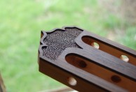
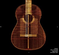
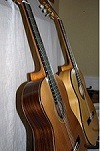
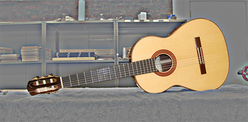
On the other hand what is a bit lacking is the photographic presentation of the guitars.

The motif should be delivered to the eye in an emphasized way / without distracting background.
One way would be before a canvas like Ethan does.

Another way ( with shop background) would be to produce layers in an app like photoshop, having the background faded ( just like on your site ) and the fully retained guitars layered on top.

Secondly, it seems no good choice to have guitars put horizontally. Neither shot in other angles than perpendicular, straight from the side or back. The estimating eye wants them to be shot centered, so that symmetrical and proportional relations shall be firm.

If photos are being put horizontally because of a larger size enabled that way, I would position the pics vertically / smaller with a "Click for enlarged image" option which shall lead to a full screen picture.

Another suggestion for to bring out the best of the motifs is the light. It should be even for documenting pictures ( which does not mean that you couldn´t place pictures of artistic value for deco, then however with special lighting, like say highly contrasting "night" scenes for instance. Like e.g. in an ambience that could be in a bar or such).

For handsome docu lighting early morning or late afternoon sunlight can be great. For levelling out shadows you can use a mirror or bright surfaces reflection.

Finally, other than for artistic takes colors should be captured neutrally ( white balance <-> can also be done in post; at least with raw format). And maybe enhance crispness by applying a bit of sharpness in post.

Ruphus

PS:
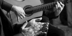
I was about to suggest that you let an advanced photographer do the images, like your B&W ones, which are looking good. Then came to mind that you want to present the pictures already done.
From there, a bit of post editing might be helpful.

PS2:
How about a dedicated site for presenting custom guitars?

PS3:
If you like to stay with the concept of presenting the guitars in shop environment, I suggest a shallower DOF / usage of wider aperture, for to expose the motif.
  REPORT THIS POST AS INAPPROPRIATE |  Date Jul. 29 2014 8:54:39
 
Ruphus

Posts: 3782
Joined: Nov. 18 2010
 

RE: New website (in reply to Andy Culpepper

- And absolutely; as has been said: Pros and celebrities are the best promotion.
With your guitars it should be easy to gather some flattering comments or clips from renown players. From there, maybe you are not fully taking advantage of options like that.

Then again, I have no doubt that your waiting list is growing constantly anyway / the promotional VIP factor about to realize by itself. :O)
  REPORT THIS POST AS INAPPROPRIATE |  Date Jul. 29 2014 9:06:01
 
bernd


Posts: 680
Joined: Feb. 15 2004
 

RE: New website (in reply to Andy Culpepper

Fine job, Andy!
I only miss more detailed fotos of your handmade rosettes.

_____________________________

  REPORT THIS POST AS INAPPROPRIATE |  Date Jul. 29 2014 10:55:54
 
Ruphus

Posts: 3782
Joined: Nov. 18 2010
 

RE: New website (in reply to Andy Culpepper

A quick & dirty example ( with object selection on the fly / untidy) of layering.


Images are resized automatically to a maximum width of 800px

Attachment (1)
  REPORT THIS POST AS INAPPROPRIATE |  Date Jul. 29 2014 12:13:13
 
Andy Culpepper

Posts: 3023
Joined: Mar. 30 2009
From: NY, USA

RE: New website (in reply to Andy Culpepper

Ah, I knew you would have a few things to say Ruphus

It's all certainly valid criticism. I've been trying to find a way to take good pictures of my guitars. I don't have natural light in my shop. I have some photographic equipment with umbrellas, etc. but I just need better bulbs. Then with some kind of sheet/paper backdrop I think I should be set.

As far as the "famous" players, there are several professionals who own my guitars but no one really famous. I'm going to try to do a better job on that page by getting quotes from those people and getting people's last names and possibly contact info.

Thanks again for all the input!

_____________________________

Andy Culpepper, luthier
http://www.andyculpepper.com
  REPORT THIS POST AS INAPPROPRIATE |  Date Jul. 29 2014 12:40:25
 
Tom Blackshear


Posts: 2304
Joined: Apr. 15 2008
 

RE: New website (in reply to Andy Culpepper

Not that this is saying much but my videos are taken by my wife's I pod phone with nothing extra.

It sounds a little high frequency but it seems to do OK. However, the guitar does have certain inter-dimensional tones that don't get picked up too well.

Your guitars are sounding good.

_____________________________

Tom Blackshear Guitar maker
  REPORT THIS POST AS INAPPROPRIATE |  Date Jul. 29 2014 15:12:48
 
Ruphus

Posts: 3782
Joined: Nov. 18 2010
 

RE: New website (in reply to Andy Culpepper

Hope to have not been sounding smart-alecky.
Just wanting the best.

Ruphus
  REPORT THIS POST AS INAPPROPRIATE |  Date Jul. 29 2014 15:14:42
 
gj Michelob

Posts: 1531
Joined: Nov. 7 2008
From: New York City/San Francisco

RE: New website (in reply to Ruphus

It is very elegant, indeed, Andy, but I must complain that photography and images don't do justice to your guitars.
I am sure you know that with all that "GAS" all we guitarists have, we dwell on the sensual pics of the beautiful guitars we plan to buy. GSI showcases them phenomenally well, with a gallery that is both comprehensive and artistic.
http://www.guitarsalon.com/p4540-manuel-reyes.html

I love this pic:


Images are resized automatically to a maximum width of 800px

Attachment (1)

_____________________________

gj Michelob
  REPORT THIS POST AS INAPPROPRIATE |  Date Jul. 29 2014 15:45:30
 
flyhere


Posts: 121
Joined: Dec. 17 2012
 

[Deleted] 

Post has been moved to the Recycle Bin at Feb. 21 2015 23:06:46
  REPORT THIS POST AS INAPPROPRIATE |  Date Jul. 29 2014 16:01:26
 
Andy Culpepper

Posts: 3023
Joined: Mar. 30 2009
From: NY, USA

RE: New website (in reply to Andy Culpepper

Are people not realizing that you can look at the images on the home page larger and scroll through them with arrows in a slide show setting? Maybe I should clarify that in writing.

Thanks again for input and I will try to put some work into this later today.

The wesbsite building I'm using (Squarespace) is limiting in certain ways but I can't really afford to have this done professionally...

_____________________________

Andy Culpepper, luthier
http://www.andyculpepper.com
  REPORT THIS POST AS INAPPROPRIATE |  Date Jul. 29 2014 16:56:14
 
flyhere


Posts: 121
Joined: Dec. 17 2012
 

[Deleted] 

Post has been moved to the Recycle Bin at Feb. 21 2015 23:06:28
  REPORT THIS POST AS INAPPROPRIATE |  Date Jul. 29 2014 17:20:24
 
Sr. Martins

Posts: 3079
Joined: Apr. 4 2011
 

RE: New website (in reply to Andy Culpepper

I agree that you should write more than "Bob" on the testimonials, it sets off my **** detector immediately.

Your signature in black (like your stamp) at the top of the page would look nice if you want to keep it simple, shouldn't be difficult.


Out of curiosity... are the plain white bone tie blocks (like on your 2A) considered to be cutting corners? It's my favourite.

_____________________________

"Ya no me conoce el sol, porque yo duermo de dia"
  REPORT THIS POST AS INAPPROPRIATE |  Date Jul. 29 2014 17:21:50
 
Escribano

Posts: 6415
Joined: Jul. 6 2003
From: England, living in Italy

RE: New website (in reply to Andy Culpepper

Nice layout, background and colour choice. Put the "about you" content on the home page. Put the guitar images in a gallery.

People buy from the person first. My two cents.

_____________________________

Foro Flamenco founder and Admin
  REPORT THIS POST AS INAPPROPRIATE |  Date Jul. 29 2014 17:22:48
 
gj Michelob

Posts: 1531
Joined: Nov. 7 2008
From: New York City/San Francisco

RE: New website (in reply to Andy Culpepper

quote:

Are people not realizing that you can look at the images on the home page larger and scroll through them with arrows in a slide show setting? Maybe I should clarify that in writing.


Yes, the Home page pics get larger and have some nice angles too, but when you look at the "Guitars" only a few and not so good pics which do not enlarge.

The Home page is an overview of your work, but prospective buyers will zoom in on the "Guitars" page and need detailed and exciting images. I respectfully submit that this needs some more work.

Also I am with Escribano that "people buy from the person first". I would add some other narrative about who you are... it is worth it, because you happen to be one cool guy...

_____________________________

gj Michelob
  REPORT THIS POST AS INAPPROPRIATE |  Date Jul. 29 2014 17:34:00
 
Ruphus

Posts: 3782
Joined: Nov. 18 2010
 

RE: New website (in reply to Andy Culpepper

For me it certainly is like Giacomo says.

When about to circle in on a relevant purchase, I want all I can get. There will never be too much of it. Info, specs, reviews, videos and not at last: pictures. Pictures, pictures, pictures.
And the more detailed and showcasing they are, the more drooling there will be on this side of the screen.
Visuals contribute a lot to imagination and to the intensity of my desire to get hands on the object. This counts even for objects where visual aesthetics come in secondary, like for guitars.

And as any reading will be welcome for customers ante portas: I would include all reviews that can be had. On the foro alone their ought to exist at least three reviews that are all positive, and one or two that indicate competence of an experienced player ( and his comparison with other highly estimated makes) I think.

Reviews pre shopping is like popcorn before theatre lights being dimmed. They will rarely initiate your desire, but always inspire when they are written enthusiastically.

Ruphus
  REPORT THIS POST AS INAPPROPRIATE |  Date Jul. 29 2014 18:26:19
 
Ruphus

Posts: 3782
Joined: Nov. 18 2010
 

RE: New website (in reply to Andy Culpepper

quote:

ORIGINAL: Andy Culpepper

Are people not realizing that you can look at the images on the home page larger and scroll through them with arrows in a slide show setting?


It just came to me that my browser is set to suppress Java ´n stuff.
So, I turned it off and visited again.

Now getting this:


Ruphus

Images are resized automatically to a maximum width of 800px

Attachment (1)
  REPORT THIS POST AS INAPPROPRIATE |  Date Jul. 29 2014 18:32:31
 
Andy Culpepper

Posts: 3023
Joined: Mar. 30 2009
From: NY, USA

RE: New website (in reply to Andy Culpepper

OK I implemented a couple of changes based on what people have said already. Does the gallery on the home page work better this way?

I'm going to tackle the "guitars" page with more pictures and a better layout, as well as work on the "players" page and get some of my more big name guys to give testimonials.

Thanks again for all the input.

_____________________________

Andy Culpepper, luthier
http://www.andyculpepper.com
  REPORT THIS POST AS INAPPROPRIATE |  Date Jul. 29 2014 21:38:29
Page:   [1]
All Forums >>Discussions >>Lutherie >> Page: [1]
Jump to:

New Messages No New Messages
Hot Topic w/ New Messages Hot Topic w/o New Messages
Locked w/ New Messages Locked w/o New Messages
 Post New Thread
 Reply to Message
 Post New Poll
 Submit Vote
 Delete My Own Post
 Delete My Own Thread
 Rate Posts


Forum Software powered by ASP Playground Advanced Edition 2.0.5
Copyright © 2000 - 2003 ASPPlayground.NET

0.0625 secs.